
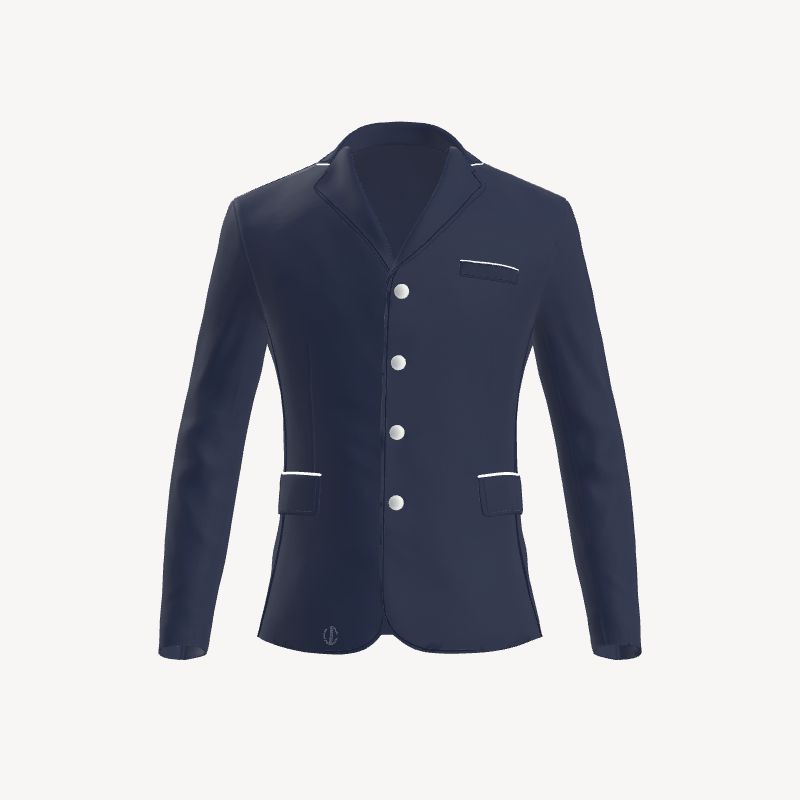
A configurator offers possibilities; it does not decide which possibilities should coexist. That responsibility belongs to the rider. The difference between custom and crowded is usually not budget or number of options—it is hierarchy.
The easiest way to find that hierarchy is to stop asking “what else can I add?” and ask “what should someone remember?”
Start with one sentence
Before choosing a colour, describe the intended impression in a single sentence: quiet and architectural; traditional with one unexpected accent; recognisable from a distance; deeply personal only up close.
That sentence becomes an editing rule. A detail stays if it supports the idea. It leaves if it creates a second, unrelated story.
Build a three-level colour hierarchy
The base colour carries most of the visual weight. A secondary colour can define collar, piping or another structural line. A third tone, if needed, works best as a small accent in stitching, buttons or an application.
When every area competes for attention, the silhouette disappears. When colour has order, even a bold combination can feel controlled.
Choose the viewing distance
Some decisions need to work across the arena: jacket colour, a contrasting collar or a strong vertical line. Others belong to conversation distance: a name, a flag, embroidery or a refined button.
Trying to make an intimate detail visible from far away often makes it oversized. Let distant recognition and close discovery perform different jobs.
Give symbolic details breathing room
A flag or name is not merely another colour block. It carries identity. The more meaning a detail holds, the less visual competition it needs around it.
This principle also protects sponsor, stable or team applications. Position and scale should respect the jacket’s seams and pockets so the garment remains a composition instead of becoming a noticeboard.
Edit once in 3D, once in stillness
Use the Digital Atelier to compare options, then pause. Take a screenshot and look at it later without opening the controls. The distance from the act of choosing makes excess easier to see.
Remove the most decorative element. If the design loses its identity, that element was doing useful work. If the jacket becomes clearer, the detail was probably competing rather than contributing.
Personal does not have to mean loud
Authenticity can be a colour nobody expects, but it can also be a lining seen only by the rider, a familiar flag, a discreet name or the exact proportion of a classic navy jacket. The point is not volume. It is recognition.
A well-edited jacket does not hide personality. It gives personality a stage.