
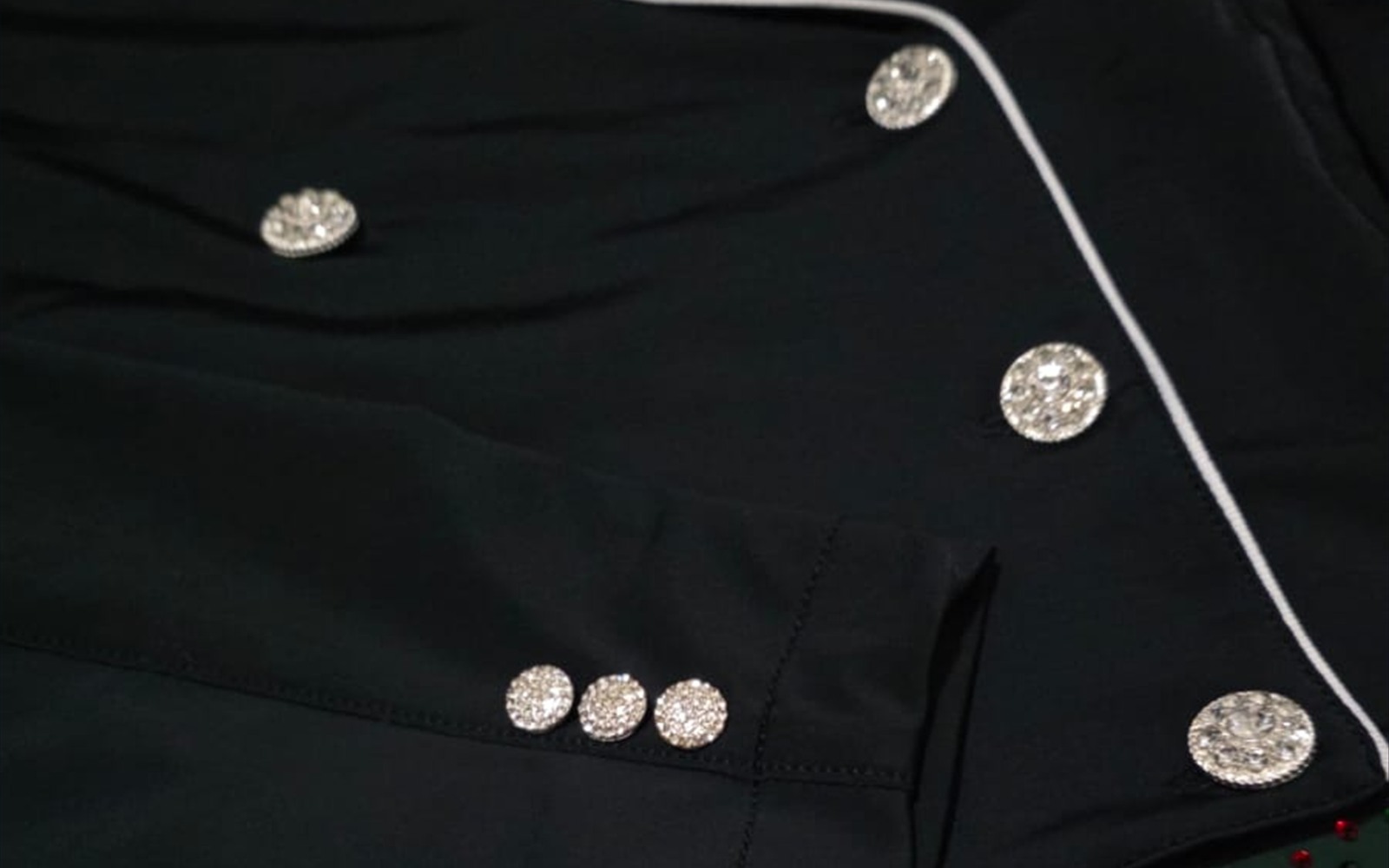
A button is small enough to be treated as an accessory and repeated enough to become architecture. On a competition jacket, the eye rarely reads one button alone. It reads a line: points that close the garment, pace the torso and return at the cuff.
That repetition gives buttons more visual authority than their size suggests. They can quietly reinforce the jacket—or interrupt it at every step.
Function draws the first line
Before colour or ornament, a button has a job. Its placement follows the closure, its scale must work with the front edge and its profile must sit comfortably against the body. Design becomes credible when decoration respects that function.
The front line should feel stable whether the jacket is open, closed or moving in the saddle. A beautiful button cannot rescue spacing that makes the garment appear uneven.
Repetition creates rhythm
One bright point is an accent. Three or four become a cadence. The distance between buttons guides the eye vertically and influences how long, compact or formal the front appears.
The cuff repeats the idea on a smaller stage. When front and sleeve buttons share a language, the jacket feels resolved from more than one angle. When every group asks for attention differently, the rhythm breaks.
Light changes their volume
Matte buttons read mainly as shape. Polished metal, crystal or faceted surfaces appear and disappear as the rider moves. Their effect is therefore dynamic: a brief reflection, then quiet again.
This movement can give life to a restrained palette, but intensity needs editing. The question is not how much a button shines in a close-up. It is how often that shine interrupts the full silhouette.
Contrast sets the tone
A tonal button integrates with the body colour and lets cut or piping lead. A contrasting button marks the closure more decisively. Neither is automatically more classic or more modern; proportion and repetition determine the result.
A useful design hierarchy gives one detail the leading role. If collar, piping, embroidery and buttons all compete at full contrast, the jacket loses the quiet space that makes each decision legible.
The cuff is a second signature
Cuff buttons are often seen at the reins, during greetings and in photographs where the hand enters the frame. They connect the sleeve to the front without copying its scale exactly.
That is why cuff detail deserves its own review. The number, spacing and relationship with trim should support the complete sleeve, not merely fill an available area.
Judge the system, not the sample
A button chosen alone can be seductive. The same button repeated seven or eight times may become much louder. The reliable decision comes from viewing all positions together on the whole jacket.
This is also where the collar hierarchy matters: the upper frame, front line and cuffs should form one sentence, with clear emphasis and deliberate pauses.
The best detail completes rather than announces
Buttons do not need to disappear. They need to belong. Their material can carry personality, national colour, team identity or jewellery-like light, provided the repetition remains controlled.
When scale, spacing and reflection are balanced, the eye does not stop at each button. It understands the jacket as complete. That is the difference between decoration placed on a garment and detail designed into it.
The photograph shows an authorised Vainqueur production detail. It illustrates design principles and does not attribute an athlete, event or result.