
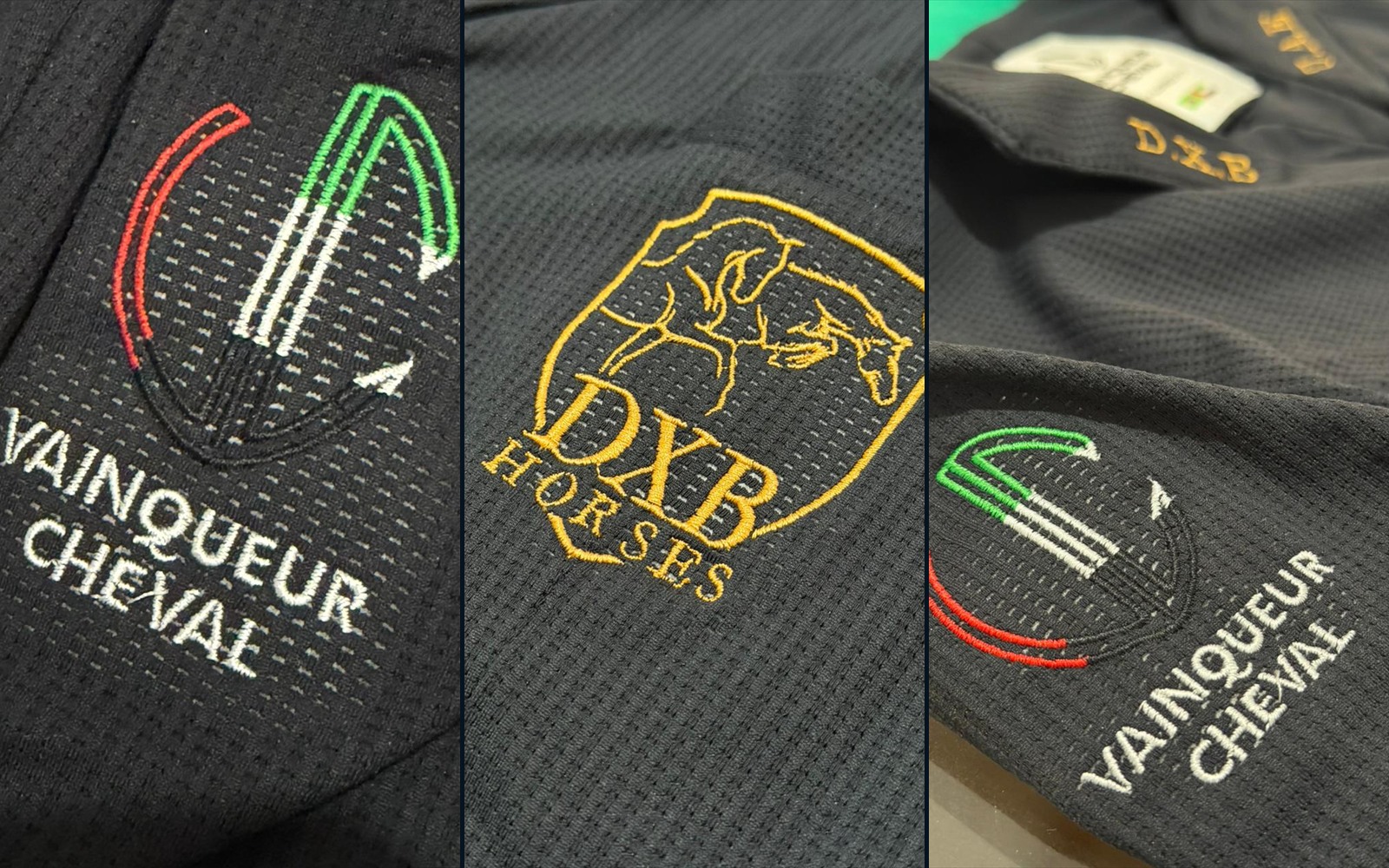
Embroidery is often chosen at the smallest scale and judged at the greatest distance. On a screen, every curve can look exact. On a competition jacket, thread meets texture, movement and the visual discipline of the arena. A successful mark survives all four.
The task is not simply to reproduce a logo. It is to translate an identity into thread without letting it become detached from the garment that carries it.
A logo and an embroidery file are not the same object
A mark designed for paper or a bright screen can contain hairline strokes, tiny counters and close spacing. Thread has volume. Fabric has movement. When the artwork becomes embroidery, the drawing needs enough structure to remain legible rather than closing in on itself.
This translation should preserve character, not every microscopic feature. Simplifying one line may make the original idea more recognisable once it is stitched.
Scale decides whether the symbol speaks or shouts
Too small, and lettering loses rhythm while thin elements disappear into the textile. Too large, and the symbol stops behaving like a signature and begins to dominate the rider. The right scale is understood in relation to the lapel, pocket, sleeve and body—not in isolation.
A close-up confirms execution. A full-jacket view confirms proportion. Both are necessary because a mark can be beautifully stitched and still be visually wrong for its position.
Placement is part of the message
The chest feels institutional and immediate. A sleeve reads differently in motion. Initials inside the lapel create a private layer of identity. The position changes not only visibility but also tone: public emblem, team code or personal detail.
Before deciding where embroidery belongs, decide what it is meant to do. Recognition, belonging and ownership are related ideas, but they do not need the same volume.
Thread colour must converse with the jacket
High contrast makes a mark fast to read. Tonal embroidery creates a quieter relief that appears as light moves across the surface. Metallic or warm thread adds another kind of presence, but it also needs space and restraint.
Colour should connect to the rest of the design—collar, piping, buttons, national reference or team palette. Repetition makes the embroidery feel intentional. Isolation makes even a well-made emblem look added afterwards.
Texture changes precision
Technical fabrics are not blank paper. Perforation, elasticity and surface relief influence the way edges and small letters appear. The embroidery programme, stabilisation and production test therefore belong to the design process, not merely to manufacturing.
This is why approval should consider the actual material and intended size. A digital preview can organise the decision, but the physical sample reveals density, relief and how the fabric behaves around the stitches.
Teams need a hierarchy, not identical noise
A team jacket can carry a shared crest, rider identification and the Vainqueur mark without asking every element to compete. One symbol leads; the others support. That hierarchy keeps the group recognisable while leaving room for individual fit and detail.
The same principle guides a team production brief: placement, dimensions, thread colours and approved artwork must be recorded once and repeated consistently.
The final test happens at two distances
First, step back. Can the mark be understood as a clean shape on the complete jacket? Then come close. Are the lines stable, the lettering open and the relationship with the fabric precise? If the embroidery only works in one of those views, it is not finished.
The strongest embroidered mark does not feel printed onto the identity of the rider. It feels built into it—clear enough to be remembered, restrained enough to let the person remain central.
The photographs show authorised Vainqueur production details. They illustrate design principles rather than a claim about a specific competition, athlete or result.