
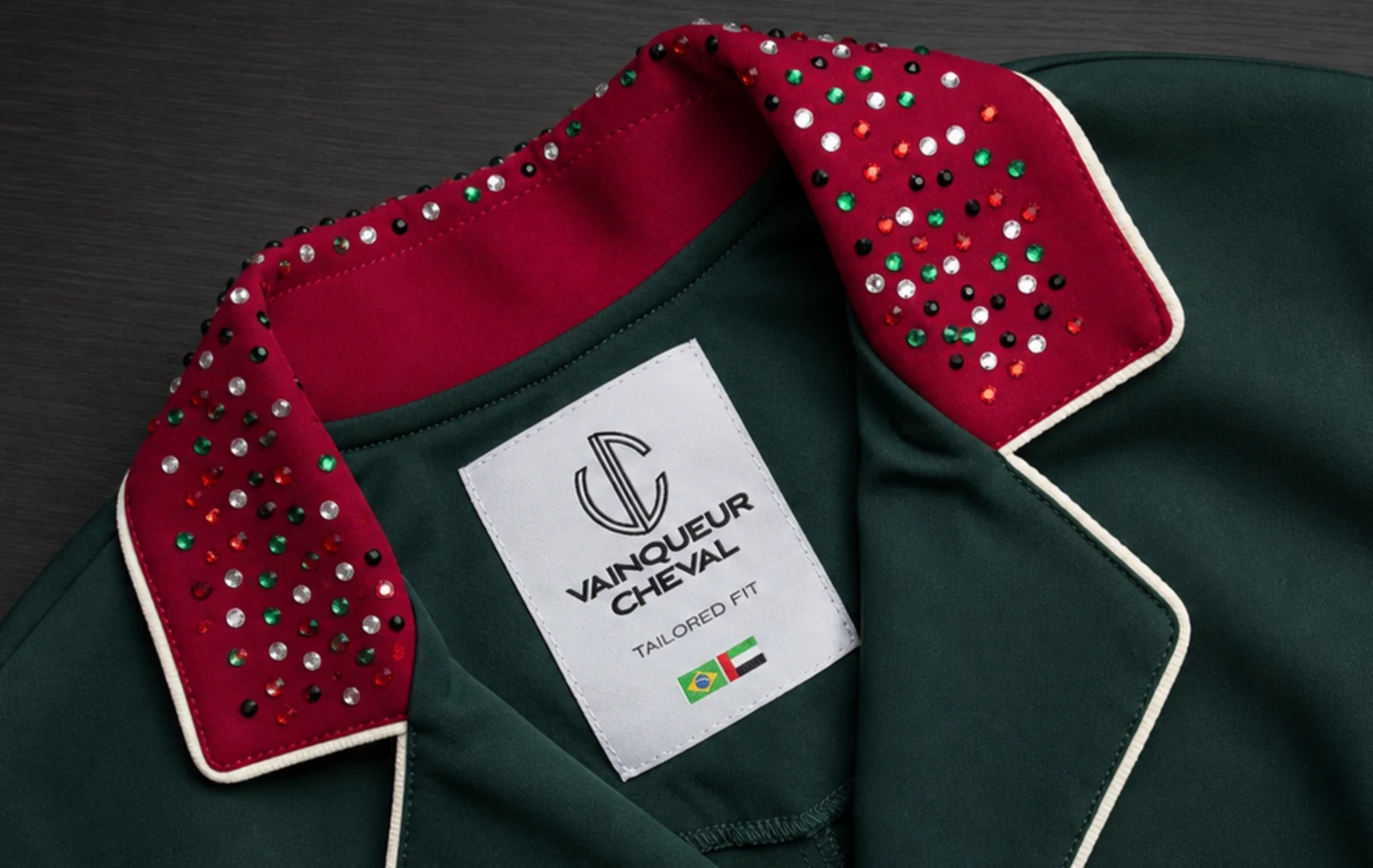
The collar occupies very little of a competition jacket, yet it sits where attention naturally gathers: close to the rider's face, helmet, shirt and the first line of the lapel. That makes it one of the most powerful places to express identity—and one of the easiest to overload.
A successful collar does more than decorate an edge. It establishes a relationship with the body of the jacket, decides where contrast begins and gives the eye a reason to understand every detail that follows.
The smallest area can set the hierarchy
Every coherent jacket has a visual order. One element leads, another supports and the rest create rhythm. When the collar is the focal point, the body colour can remain composed while the upper line carries the personality.
This hierarchy is especially useful from arena distance. A viewer may not read a name or count individual crystals, but they can still perceive a clear band of colour, a bright edge or a contrast that frames the rider. The detail works first as a shape; only at close range does it reveal its material.
Contrast can be quiet or decisive
A collar in the same colour family as the jacket creates depth without breaking the silhouette. A contrasting colour creates a more immediate frame. Neither direction is inherently more elegant. The deciding question is whether the contrast belongs to the rest of the rider's visual language.
Repeat can make a bold choice feel intentional. A collar colour echoed in a fine piping, button, embroidery or team reference creates connection. Without that relationship, even a beautiful accent can appear isolated.
Light changes the way ornament is read
Crystals, metallic surfaces and satin finishes do not behave like flat colour. They appear and disappear as the rider moves, the arena lighting changes and the camera angle shifts. That movement can give the collar life, but it also means the design should be judged in more than one view.
A close-up tells whether the placement is precise. A full silhouette shows whether the brightness dominates. A rotating preview can help compare proportion before production, while a final human review considers material and construction together. This is why seeing choices combined in the Atelier 3D is more useful than selecting each option in isolation.
The face and the collar share one frame
The collar is not viewed alone. Helmet colour, hair, shirt, stock tie and skin tone all enter the same visual field. A choice that looks restrained on a fabric swatch may become strong when placed directly beneath the face; another that seems bold on the table may settle naturally once the complete competition look is assembled.
That is why the best question is not simply “Do I like this collar?” It is “What does this collar make the eye notice first?” The answer should still be the rider—not the decoration separated from them.
Personal meaning needs editing
National colours, stable identity, initials and personal references can all find a place near the collar. Meaning adds value, but it does not remove the need for selection. When colour, piping, crystals, embroidery and buttons all compete at equal volume, the story becomes difficult to read.
Editing creates strength. Choose the message the collar should carry, then allow surrounding details to support it. The same discipline guides a complete personalisation system: identity is not the number of options used, but the clarity with which they belong together.
A signature is built through repetition
A single memorable collar can attract attention. A consistent visual choice across seasons, jackets or team pieces can become recognition. Repetition turns preference into language.
That does not require copying the exact design forever. The base colour may change, ornament may become more restrained and a competition context may ask for another level of formality. What remains is the principle: where the contrast sits, how much light it carries and how the detail relates to the rider.
Design the collar from far away first
Begin with the whole silhouette. Decide whether the collar should lead or support. Then move closer to select colour, edge, texture and ornament. This order prevents an attractive close-up from becoming an unrelated object when the rider enters the arena.
The strongest collar is not necessarily the most complex. It is the one that makes the jacket feel unmistakably complete—small in area, precise in purpose and personal without losing composure.
This essay reflects Vainqueur's design practice. Digital previews help compare proportion and placement, but colour, reflection and material can vary with lighting and displays; final choices remain subject to human review and production confirmation.