
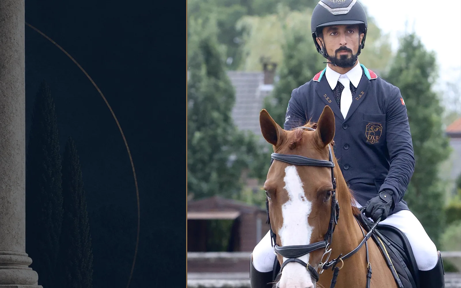
Some riders are recognisable before the scoreboard confirms their name. The impression does not always come from a dramatic colour or an oversized emblem. More often, it comes from consistency: a silhouette, a controlled palette and a handful of details that return often enough to become familiar.
That is what separates decoration from signature. Decoration asks to be noticed once. A signature becomes more legible every time it appears.
A signature begins at arena distance
From the opposite side of a ring, the smallest embroidery disappears. What remains is proportion, posture and the main field of colour. This is the first layer of identity: the jacket as a complete shape rather than a collection of options.
A strong base gives the eye somewhere to settle. Navy can feel traditional or graphic depending on the lines around it. Black can look severe, quiet or highly modern. A less expected colour can still read as refined when the silhouette remains clear. The decision is not simply which colour is most distinctive; it is which colour can carry the rider's presence repeatedly.
Structure speaks at the middle distance
As the rider comes closer, the second layer appears: collar, piping, buttons and the rhythm of the front. These elements work like punctuation. They can sharpen a line, repeat a stable colour or lead the eye towards the face without competing with the whole jacket.
This is where restraint becomes useful. If every edge, button and panel demands equal attention, none can become memorable. One leading gesture—perhaps a collar treatment or a precise line of contrast—usually gives the quieter decisions more authority.
Meaning belongs to close range
A name, initials, flag or team application is read differently from colour. It does not merely add contrast; it carries belonging. These details often matter most to the person wearing them, which is precisely why they do not need to shout across the arena.
Placed with room around them, they reward proximity. The viewer first sees a composed rider, then discovers the personal information. That order protects both identity and elegance.
Repetition turns a choice into a language
A visual signature is not created in a single afternoon. It develops when related decisions appear across seasons, horses and photographs. The exact jacket may evolve, but a familiar colour relationship, collar line or level of restraint can keep the rider recognisable.
Repetition does not mean freezing the design. It means knowing which element is the anchor and which elements are free to change. A signature with no room to evolve becomes a uniform imposed on the future. A signature with no anchor is only a sequence of unrelated looks.
The saddle is the final editor
A jacket is chosen while standing still, but it is remembered in motion. In the saddle, posture changes the way lines meet. Arms move forward, the front opens and closes, and the rider becomes part of a larger image with the horse, tack and arena around them.
This is why a successful detail should support the whole composition rather than depend on a single static view. The identity must survive movement: readable without becoming rigid, distinctive without pulling attention away from the partnership.
Individual and team identity can coexist
A team needs a common visual vocabulary, but uniformity does not require every person to disappear. Shared base colours and applications can establish collective recognition while measured choices in fit, proportion and secondary detail preserve the rider inside the group.
The balance is the same as in an individual jacket: decide what must repeat, then decide where personality is allowed to breathe.
Authenticity is coherence over time
The most authentic jacket is not necessarily the most unusual. It is the one that makes sense beside the rider's history, discipline, team and own sense of self. Originality can be quiet. Sometimes it is a bold colour; sometimes it is the refusal to add anything that does not belong.
Digital preview helps because it lets the complete combination appear before production. But the most important question is still human: if the name and logo disappeared, would this design still feel like the rider?
Shk. Rashid bin Ahmed Al Maktoum, pictured in this editorial, is a current Vainqueur Cheval sponsored athlete. The photograph belongs to the brand's authorised archive. This essay discusses visual language and does not attribute the image to a specific event or horse.